The Sizely brand kit.
Everything you need to use the Sizely logo correctly: vector and raster files, colors, type, and the rules. All glyphs are outlined, so the SVGs need no fonts installed.
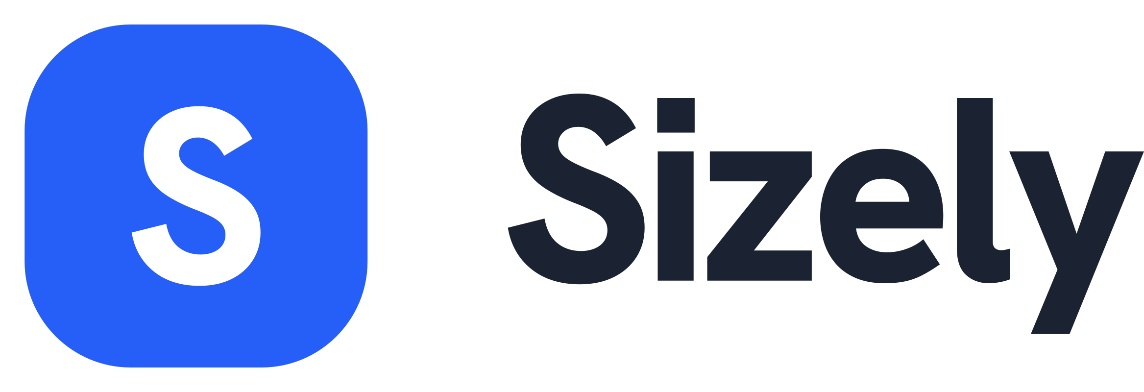
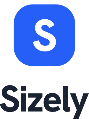
Logo & lockups
The primary lockup is the blue squircle icon + the “sizely” wordmark in ink. One color, Hanken Grotesk ExtraBold. Use the primary on light backgrounds; the reversed version on dark.

When the icon is redundant. A lowercase lockup is also in the kit.
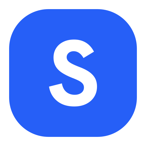
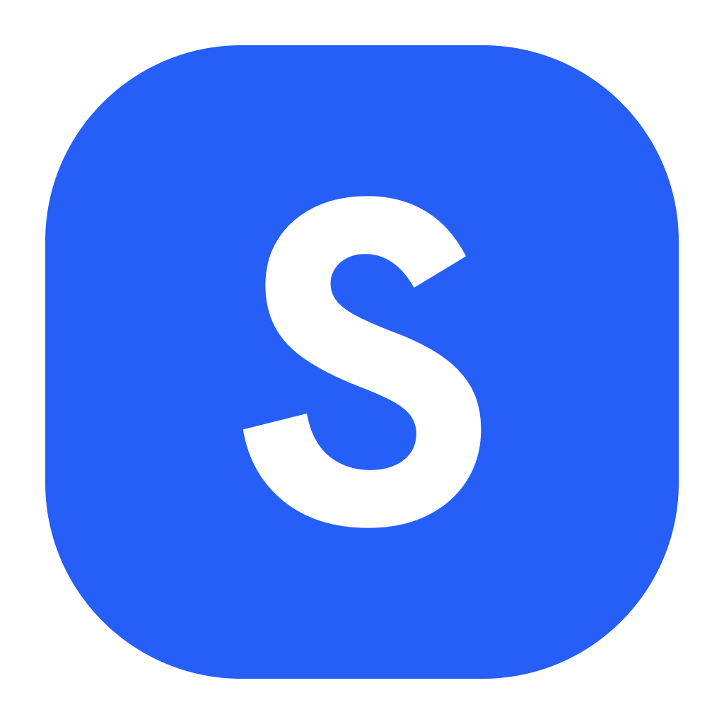
App icon & favicon
The squircle “s” stands alone for app stores, social avatars and favicons. Brand blue is primary, with ink and light variants included.
Holds on dark surfaces.
Monochrome contexts.
White squircle, blue s.
Profile picture
A ready-to-use square avatar for social profiles. Download the PNG and upload it as your picture on any platform. Most platforms crop to a circle, so the mark stays centered and safe.
White mark on brand blue. Stands out on light feeds.
Blue mark on white. Cleaner on dark feeds.
Square 1024 × 1024 PNG. Want a transparent squircle instead? Use the app icon files above.
Clear space & minimum size
Keep clear space around the logo at least equal to the height of the icon on every side. Don't crowd it.
Don't use the full lockup below 120px wide. Switch to the standalone icon (works down to 16px). Always scale proportionally.
Color
Two core colors: ink for the wordmark and text, brand blue for the icon and actions. Click a swatch to copy its hex.
Download all values in brand-colors.txt.
Typography
The logo uses Hanken Grotesk ExtraBold (800). The same family carries headings and UI across the product, so the brand reads as one system. Free on Google Fonts.
Don'ts
The wordmark is always one color. Never gradient, recolor, distort, or decorate the logo.
Don't stretch or squash.
Don't recolor the wordmark or icon.
Don't rotate or tilt.
Don't add shadows, gradients or effects.